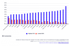
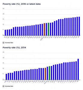
These graphs compare overall income inequality in OECD countries, using the Gini coefficient, for which a higher score represents greater inequality.
2017-18: The graph shows that income inequality in Australia in 2018 – the latest date for which comparative data is available – was close to the average level for wealthy nations.
2015-16: It shows that income inequality in Australia in 2015 – the latest date for which comparative data is available – was higher than the OECD average. Australia sits between other English-speaking countries, above Canada but below the United States and the United Kingdom; and alongside some countries with lower income levels, like Greece and Portugal.
Most European countries had much lower income inequality than Australia.


