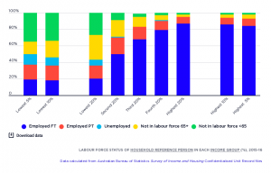
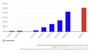
This graph shows the main sources of household income for people ranked by the income of their households in 2017-18 (the latest date for which figures are available) and 2015-16.
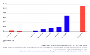
2017-18: Wages and salaries represent the main source of income for all income groups except the lowest. Social security payments are the largest income source for the lowest 20% (54% of their income) but in our highly ‘targeted’ system these payments comprise 25% or less of total income for all higher-income groups. Investment income only forms a sizeable share of the incomes of the highest income groups, for example 29% of the income of the highest 5%.
2015-16: Wages and salaries represent the main source of income for all income groups except the lowest 20%, which instead received most of its income (60%) from social security payments. Investment income and income from own-businesses and self-employment are much smaller components of income overall. However, together they comprise 20% or more of the incomes of the highest and lowest 5%. Note that there are doubts about the placement of many households reliant on investments or self-employment in the lowest 5% , as their incomes often appear to be under-reported.